Archive for the ‘Assignments’ Category

Scrubs online magazine
The purpose of the online magazine Scrubs is to guide nurses and nursing students in their personal and professional lives. The audience is nurses and nursing students. It can be seen mostly from the content of the website. It is not gender oriented. Throughout the website we can see pictures of people in the nursing uniform of different gender, age, ethnicity, size, etc. Nursing is a culturally diverse profession that is also can be seen on the website. The website design is not an extraordinary but pictures and subjects will definitely attract nursing (current and future) audience. The busy organization of the website most likely not to scare nursing audience due to the amount of reading they always get.
Design elements:

Example of Emphasis
Emphasis. Although the website is pretty crowded, the viewer is guided by the red color which shows what pieces of information are the most important. The website employs the idea of visual hierarchy which allows arrangement of elements according to their importance. Firstly, big heavy red line on top of the page shows the name of the website along with main categories. Secondly, throughout the main page the viewer can see other red colored headings with red separation lines which guide the gaze. Thirdly, the headings are of different importance on the main page and the rest of the pages. This can be seen from: The biggest, the boldest, and the brightest text. These declines as the viewer reaches less significant headings.
Contrast. Using this principle allows visually organize information. As been said earlier the website employs contrast by size (Bigger headings vs smaller rest of the text), weight contrast (bold headings vs regular text), color contrast (shades of red and black).
")
Example of Balance
Balance. The page is symmetrically balanced. It can be divided in the middle into two symmetric parts. However, the website has nursing info on the left side and ads on the right side. If we take into account only nursing info – it is also symmetrically balanced. It is also balanced by color. Red color is evenly distributed throughout the page.
Alignment. Organizes page into orderly message. Firstly, lines which are grouped belong together by containing relative information which makes it easier to follow the message. Secondly, the website employs flush left type of text alignment. The messages are quite long which makes it best to use this type of text alignment. The lines are of the same width. Thirdly, some empty space makes webpage less busy and gives separation to different subjects.
Repetition. Makes the page easier to read and navigate. Repetition of shapes – each topic is placed in a separated rectangular. However, even the content is different, same organization is used in each rectangular: same heading styles, colors (repetition of color), and one image (repetition of images). This style unifies the website and makes it easy to navigate and recognize relative information and structure.
")
Example of Flow
Flow. Takes the viewer of the webpage throughout all of its elements emphasizing what’s important. It gives the order its natural flow from top to bottom. SEQUENCE: The ad is made in a vertical pattern together with a horizontal pattern. On top of the image where the gaze goes first we can heavy red line with the name of the website. Then our gaze goes down. At the midline our gaze stops for a moment while trying to look at the changing messages which increases our curiosity. We keep moving towards the bottom where we can see horizontally equal rectangulars. These structures confuse us a little bit. Our gaze afterwards keeps going down.
Design elements guide the audience throughout the website. The color is unisex which doesn’t concentrate on any specific gender. The contrast and emphasis make it easier to find more important points. However, the website seems a little bit too busy. The switching subject window with current news should be bigger. The news could be contrasted for current/future nurses.
The website constantly uses outside resources such as images. Images are cited with the name of the photographer or a company with no link provided.

Advertising Agency: Leo Burnett Iberia, Madrid, Spain
Creative Directors: Francisco Cassis, Paulo Areas
Art Director: Pouline Atencio
Copywriter: Roberto Luque
Illustrator: Pouline Atencio
Published: December 2010
Posted on Ads of the World
 The purpose of the ad is to sell Bounce, an anti-static sheets you put in the clothes dryer. The audience of the ad are women who wear dresses or other types of clothe which deal with the static electricity issue. Firstly, the pink color of its background attracts feminine audience. Secondly, the image of the dress is likely to draw attention of women rather than men. The dress itself is made of physics structures which may not appeal to women a lot. However, static electricity is a physics feature. Therefore, someone with knowledge of physics can solve this problem and women will be free of it. The ad can be found in women’s magazines.
The flow principle of design is definitely used here. It takes the viewer of the ad through all of its elements emphasizing what’s important. It gives the order its natural flow from top to bottom. SEQUENCE: The ad is made in a vertical pattern with a few horizontal lines which enhances the vertical flow even more. On top of the image where the dress begins we can see an arrow pointing to the bottom of the image. At the midline our gaze stops for a moment while trying to understand why would this zig zag lines be on the dress which increases our curiosity. We keep moving towards the bottom where all these physics structures confuse us even more. Once reached the bottom our attention is cought up with trying to figure out what’s it all about. From here the viewr’s gaze with the help of the ride side of the dress is bounced towards the brand’s name where our problem is solved.
Overall my classmates did a good job. However, what I have noticed – which helped me realize my mistakes is that we all probably saying the right things but we don’t use much terminology. We most likely to describe what we see but we don’t apply our knowledge to describe it in a right terms related to specific design. For example, we can talk a lot about shadows when we can simply say – contrast by color or symmetrically balanced. We are university students; therefore, we need to learn to think professionally and critically (in terms of deeper meaning behind the image).
Contrast
http://mblac018.students.digitalodu.com/?p=133#comment-193
http://mquer005.students.digitalodu.com/?p=129#comment-127
Alignment
http://jcher021.students.digitalodu.com/?p=116#comment-130
http://mquer005.students.digitalodu.com/?p=134#comment-126
Balance
http://nzewd001.students.digitalodu.com/?p=77#comment-102
http://dsmit182.students.digitalodu.com/?p=222#comment-119
Key words
Identity “represents the process by which the person seeks to integrate his (sic) various statuses and roles, as well as his diverse experiences, into a coherent image of self”. (Epstein, 1978, p. 101)
Professional identity is defined as one’s professional self-concept based on attributes, beliefs, values, motives, and experiences (Ibarra, 1999; Schein, 1978).
Online identity, internet identity, or internet persona is a social identity that an Internet user establishes in online communities and websites (Online identity, 2012).

Posted on Flicker by TakenByTina
Brief summery
Professional identities are built up on how we feel about being professionals, what do we do as professionals, and how our colleagues see us. Since recently we can also add to it who we are outside of working facility and who we are online. Things we do, write, say, type; even who our friends are can tell a lot about us even to those people who we had no intention to give the information to. Our personal have fused with the professional (Kerwin, 2008). It is called social background check. More information can be found here. So it is best to keep the information private and clean. Be aware that everything you say online can be traced to you, and you can get in trouble or……if you wisely mange the information you share online, may actually work FOR you! If your online reputation is not great, there are surely certain things you may do to clean it up: however, the best thing you can do is to carefully watch what you do and eventually with whom and where you share it.
Relations to course outcomes
As current students we have to understand that we are about to enter professional world where things we do and say matter. Unfortunately (or fortunately) this becomes a big deal not only since the time we get our diploma but much earlier…as soon as we join online membership. Therefore, as future professionals we have to build our online reputation today so we can get hired tomorrow.
Works Cited
Epstein, A. (1978) Ethos and Identity, Tavistock, London
Kerwin, A. (2008, July 07). Managing Your Professional Identity. Retrieved November 09, 2012, from slidshare : http://www.slideshare.net/awildish/managing-your-professional-identity-502562
Online identity. (2012, October 12). Retrieved November 09, 2012, from Wikipedia: http://en.wikipedia.org/wiki/Online_identity
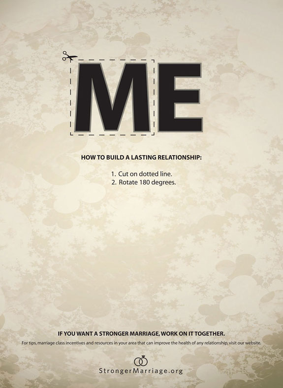
(Advertising Agency: Richter7, Salt Lake City, USA
Posted on demilked
The purpose of the ad is to advertise the company which offers services on making marriages stronger. The target audience would be married couples who are unhappy in their marriages. By only looking at this ad couples who want to improve their relationship can already get a worthy advice which may make them to go on the website. The image with emphasized ME looks gray and lonely which makes the viewers compare their lives with the world where “ME” dominates. By cutting out M and turning it over couples may change their lonely lives and become happy again. The ad could be found where married couples are: on the streets, magazines.
The ad employs alignment principle of design which organizes page into orderly message.
*Firstly, lines which are grouped belong together by containing relative information which makes it easier to follow the message.
*Secondly, the ad employs centered type of text alignment. The message in the ad is rather short allowing it to use this type of text alignment. The second line is the same wide as the word ME. The directions (3d and 4th lines) are easy to follows due to numbered format.
*Thirdly, a lot of empty space and grey cold colors coincide with the idea of loneliness which people with unhappy marriage may experience.
The image also uses the following principles:
-Contrast – black letters on light background, bold vs regular type
-Balance – symmetrical left and right sides
-Emphasis – the word ME with “cut out” option

Advertising Agency: LOWE Adventa, Moscow, Russia
Creative Director / Art Director / Copywriter: Andreas Mielenhausen
Designer: Roman Alekhin
Published: October 2010
Posted on Ads of the World
Beeline is a network company which offers mobile, TV, and internet services. Main office is located in Russia (it may explain why you probably never heard about it). It has always been known for the creativity of its ads. In its ads it has always had young people which are the target audience. Those young people are not shown here; however, the types of technology which are shown in the ad are mainly for younger generation users. Besides, younger generation tends to have less money; therefore, they would be more likely to look for discounts for necessary services. Young families are also a target population who could benefit from buying a package for their new home. This ad can be found anywhere where the younger people are: on the streets, in the magazines, on TV, online on the websites, etc.
This image uses strong contrast which quickly and effectively attracts attention.
Contrast by color: There are two color ideas. Firstly, message in black and yellow stands out very well on the white background allowing all attention to the message. Secondly, addition of yellow color to identify the product itself contrasts with just black color of the other parts of the message. The yellow color elements are balanced on the page (left upper corner and right lower corner) which also emphasize the element of flow where gaze comes from the upper left to lower right where the brand name is.
Contrast by size: coincides with whole idea. On the left side, where the first attention is drown due to the contrast by color and size, the viewer can see products – a lot of products which occupy the better portion of the image. In other words, a big package. While on the right side same elements shown from the other angle but they look smaller which matches the idea of paying a little money to buy the big package. The image employs the principle of symmetrical balance.

Advertising Agency: Y&R Reklamevi, Istanbul, Turkey
Creative Directors: Ozan Varışlı, Utku Gürtunca
Copywriter: Ömer Onsun
Art Director: Erhan Dursun
Illustrator: Zoo Istanbul
Client Directors: Özlem Ünlüçay, Burçin Yavuzarslan
Published: May 2010
Posted on Ads of the World
The purpose of the ad is to sell energy saving washing machines by Arcelik. The intended audience would be urban residents who practice or would like to practice saving the environment, in other words, use “green” technology. It can be seen in the ad due to green spots among the urban buildings and the text on the bottom saying “World needs more green”. The washing machine in a lower left corner doesn’t attract the most attention which makes it look even more natural within the given environment. In addition, the clothes inside the washing machine are green which strengthens the idea. It could be assumed that the ad is for female customers because it deals with household product; however, there is no direct relation to females in color or composition. Moreover, the image itself looks gray, very high tech, and detailed; therefore, it creates the same impression of the washing machine, which can attract attention of male customers.
Image could be found in household magazines, in magazines promoting “Green” life style, in any kind of biological or geographic magazines, business magazines, or on billboards in urban areas or parks. After viewing the image a viewer can be inspired to find out more about this product or even search for other “green” products and benefits of using them.
This image is a little crowded; however, author(s) was (were) able to achieve balanced to make it more functional and proportional. Color wise the image is very consistent. It employs only shades of gray and dark green which are evenly distributed throughout the image and give image natural urban colors with emphasis on necessity of increasing of green environment. There is a dark grey frame which creates an illusion that objects that are inside are “lifting” off the page. The right upper corner catches the first attention. Then the gaze goes to the biggest middle ring, and then to the washing machine itself (Principle of flow). Pretty much the whole image copies shape and idea of the washing machine (principle of repetition). From there the viewer looks at the brand name which is very distinct and easy to read. All four corners have something whiter and brighter than the rest of the image. Moreover, the biggest circle is located right in the middle. It all employs symmetrical balance.
The principle of balance of the image is mixed with principles of repetition and flow making it more communicative and functional.
Advertised by Advertising Agency: Bates Y&R, Copenhagen, Denmark. Posted on TOXEL.com
Jeep is a model of car which is popular nowadays. It is best known for its ability to ride off roads and on roads in bed conditions. Sometimes people who live in urban areas don’t get to enjoy this advantage of the brand due to good quality of roads. Therefore, the purpose of the ad is to sell Jeep to urban residents . The ad is fun and inspirational. The audience of this ad would be urban drivers who enjoy challenges and like riding anywhere with no limits even within the cities. It is seen in the ad because parking spaces are in very inconvenient locations where it wouldn’t be possible to park for other types of cars. Jeep is usually for middle class population primarily because of the gas cost. In addition, this ad may appeal to younger generation because younger people tend to do something reckless like parking on curb or off road. The ad could be found in car magazines, in magazines focused on outdoor activities, and in crowded cities with little parking lots. After viewing the ad the audience may wonder what are other challenges Jeep can deal with so it may make them go on Jeep website or or Jeep dealership.
Repetition principle is seen in four images combined together in one picture. All images are very similar. All of them were taken in urban areas in different locations but with the same idea. All pictures are of a grey shade with bricks and some kind of barrier (stairs or curbs) and white lines with Jeep logo in each of them. Right upper and left lower pictures were taken from the same angle as well as left upper and right lower are of the same angle. The right upper square attracts the most attention it is well defined and the most challenging. Repetition principle supports the audience by showing in every picture that Jeep owners can deal with all the challenges. It shows constant challenge which strengthens and unites the idea. The design is organized which makes it easy to interpret for the audience.
Key terms
Images are powerful part of page designer’s palette, they add impact to pages by making them more visually appealing, by evoking reader curiosity, urging reader action, or communicating important information.
Photographs are powerful visual images that can evoke strong emotional response in people because most people assume that camera doesn’t lie.
Cropping refers to the removal of vertical edges of a picture.
Flopping simply changes the direction of the image in a photo from side to side.
Silhouetted photos have portions selectively removed.
Illustrations can be diagrams, maps, charts, cartoons, or drawings. They are useful for telling a story or showing complex and detailed information that is otherwise difficult to show in any other way.
Clip art is a predrawn artwork that is sold in books, on disc, CD, or online.
Dingbats are small ornament pictures useful as bullets, icons, or small pictures.
Brief summery
The author talks about the importance of pictures in the works of digital writhing. Images style and add visual interest to pages. However, inappropriately chosen images confuse and distract the audience. There are few type of images can be used depending on concept and resources. Photographs seem more real than illustrations. In turn, illustrations are the only effective way to visually show ideas or abstract concepts. The right type of image helps put across a lot of information in a small amount of space. Images can be created by author or purchased for single use or multiple use design. Another resource is clip art which can be big time-saver.

Posted on flckr by zachstern
This is an example of editing pictures. The author takes an original and then works with it using photo editing tools.
In this case author multiplied the number of copies and edited copies in order to show the audience the difference. Therefore, his edited image goes together with the text. The text can be found here.
Relations to course outcomes
In the world of digital writing images play a tremendous role by reinforcing, explaining, and emphasizing text. Being able to create, select, edit, etc. pictures and effectively apply them in the work enhances the effectiveness and help communicate with the audience quickly. In our class we not only learn principles of working with pictures but also analyze works of others by looking at advantages and disadvantages.
Works cited:
Graham, L. (2005). basics of DESIGN. (second, Ed.) Canada: Thompson Delmar Learning. 306p. Pint.
Key Terms:
Emphasis states the that the most important element on the page should be the most prominent, the second most important element should be second to the most prominent, and so on. It works hand in hand with the principle of contrast. The primary focus of emphasis is the intellectual analysis of the message to determine which words and phrases and graphics are the most important and, therefore, should be the most visually prominent.
Visual hierarchy refers to the arrangement of visual elements on the page according to their order of importance and emphasis.
Focal point is the visual element or part of a page that is most emphasized and therefore catches reader’s eye first.
Accents are secondary and tertiary focal points
Brief Summary:
We need to use emphasis to simplify the reader’s task and help pick out the most important things of the message. Determining the hierarchy and order of emphasis takes some effort but it improves with practice. Begin by deciding which words or phrases are the most important with consideration of the audience. Once decided, visual hierarchy plan is developed. This plan directs the reader’s attention to focal points. however, the author shouldn’t make too many focal points in order not to overcrowd the content. Some people find it handy to look at other people’s pages for inspiration and observation. Professional graphic designers use a number of visual techniques to establish strong hierarchy (e.g. making it boldest, biggest, and brightest, etc.). One problem that novices experience is that they overuse it. However, learning a skill means that missteps will occur. Keep the message simple, avoid emphasizing everything, and practice, practice, practice!
Relations to Course Outcomes:
It is very important for us the students of digital writing class to appropriately deliver the message. Therefore, we need to learn principle of emphasis in order to decide which pieces of information are the most important. It makes ir easier for audience and makes students effective writers.

This is an example of good emphasis technique. The most important words are the biggest and brightest which allows the audience to see the clear message.
Works Cited
Graham, L. (2005). basics of DESIGN. (second, Ed.) Canada: Thompson Delmar Learning. 306p. Pint.