(Advertising Agency: Richter7, Salt Lake City, USA
Posted on demilked
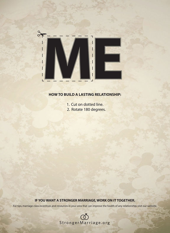
The purpose of the ad is to advertise the company which offers services on making marriages stronger. The target audience would be married couples who are unhappy in their marriages. By only looking at this ad couples who want to improve their relationship can already get a worthy advice which may make them to go on the website. The image with emphasized ME looks gray and lonely which makes the viewers compare their lives with the world where “ME” dominates. By cutting out M and turning it over couples may change their lonely lives and become happy again. The ad could be found where married couples are: on the streets, magazines.
The ad employs alignment principle of design which organizes page into orderly message.
*Firstly, lines which are grouped belong together by containing relative information which makes it easier to follow the message.
*Secondly, the ad employs centered type of text alignment. The message in the ad is rather short allowing it to use this type of text alignment. The second line is the same wide as the word ME. The directions (3d and 4th lines) are easy to follows due to numbered format.
*Thirdly, a lot of empty space and grey cold colors coincide with the idea of loneliness which people with unhappy marriage may experience.
The image also uses the following principles:
-Contrast – black letters on light background, bold vs regular type
-Balance – symmetrical left and right sides
-Emphasis – the word ME with “cut out” option
Great post. I agree that the purpose of this ad is to advertise a company that helps married couples. I also liked that you put other principles this ad follows at the bottom.