Hi everyone! My name is Victoria Simonyakina! This is my last assignment for English Digital Writing class at Old Dominion University.
Throughout the entire semester I have learned to be not only active consumer of digital writing but also an active producer of it. Digital Writing class thought me how to use modern solutions in the modern lifestyle. The outcomes of the class were based on the work of Jenkins’ article, “Confronting the Challenges of Participatory Culture: Media Education for the 21st Century.” This what I learned in the class:
- Play — In an experimental way I was able to work on my projects: website, postcard, and online identity. It took me some time to figure out how I wanted it to look like. I didn’t simply think of it I played with it. For Wiki project I moved pages around until I found a way to fit my needs. The example in this case would be a process and the result of playing would be final version of the Wiki. For postcard project I first created one text and recorded it with Text to Voice program; however, I played with another idea – the final version with my own voice and it worked better.
- Performance — While working on Project 2 I was able to adopt female student identity for the purpose of delivering message on Digital Writing topic. I have chosen appropriate resources to create the message which made it look and sound attractive to female students.
- Simulation — as part of Project 3 I created my Resume, LinkedIn profile, Timeline, and Video Resume. However, while it was graded it still is resource I can directly use in my real life which can help me benefit building my online professional identity.
- Appropriation — While I worked on Project 2 my goal was to define Digital Writing appropriately with the intended audience. Therefore, I found appropriate resources: image and music. I chose appropriate information, mixed it, edited it, and came up with the ready-to-go postcard which contains meaningful information for appropriate audience.
- Multitasking —While working on Project 3 I had to use different resources to create my Traditional Resume, Timeline, and Video Resume. I had to choose information I wanted to include in those. However, the purpose of each of these three components are different. While wanting to look professional, I had to shift my attention from one component to another in order not to lose the purpose of each.
- Distributed Cognition — While working on my projects I had to expand my reasoning skills on what to include in them. I had to play with different type of technologies which could do something I would not be able to do without. For example, editing images, making movie. From some of the articles we used I discovered terms and issues I have never thought about. They expended my knowledge and taught me critical thinking lessons.
- Collective Intelligence — Perfect example of it would be what we did as team during the while working on Project 1. During the first part we had to provide the wiki with different information we learned in class. Each team member contributed his or her time, knowledge, and skills. During the second part we sorted the information and organized it in a meaningful way.
- Judgment and networking — would be examples of how I searched, chose, mixed, and evaluated information. There are lots of outside sources which I used during the project. As digital writer I were able to find information and process it. I chose the appropriate and reliable information. In addition, I gave credits for the authors by citing all the works used.
- Transmedia Navigation — The media is always changing; therefor, during the period of one semester we tried to play with different types of media and technology: Wiki, Music, Video, Online Articles, Network Websites, etc. We were taught the basic skills necessary to play with technology. Upon these knowledge in future it would be easier for us to adopt to newer technologies.
- Negotiation — While working on Project 1, we worked as a team. Each member of the team has his or her own point of view depending on his or her values, experiences, culture, etc. While trying to find the common grown, we first listened to all opinions and second chosen the idea which fits all of the opinions.
The most outcomes I applied this semester were play (experimented with different type of technologies), appropriation (rhetoric on the town – appropriate sources for appropriate audience), and simulation (real life tasks like Professional Online Identities).
I would like to work more on negotiation (working in teams) and multitasking (shifting attention while having common goal).

Posted on Flicker by Krissy.Venosdale
In today’s world women hesitate taking classes or choosing majors which deal with technology thinking that it might be too hard for them. I was not an exception. It happens because in our society male association with technology predominates. Women are socialized as passive consumers of digital writing when in reality they are not only active consumers but also are more than capable to become successful producers in the digital world. I learned that taking a picture, editing it, and posting it online is already digital writing. Some may argue that if it is so easy why take this class? The answer is you need to explore digital writing tools. Thee are so many of them today and we are in process of changing all the time. This class teaches critical thinking and basic skills we need to be able to work with ever changing technology because they all are built upon the certain structures just keep improving. A lot of products of digital writing uses multimedia. For example, when making postcard one uses music, video, voice recorder, and, eventually, medium to put it together and share. This class gave me more confidence that I can be a digital writing producer just need to practice my skills I gained during the class. I consider myself more educated primarily because I am aware of the tendency and structure of digital world, even though still need to improve my skills.
Thank you Professor Rodrigo!
The purpose of traditional resume is to provide potential employer with necessary information to obtain vacant position. The ultimate goal of traditional resume is to facilitate getting a job. Therefore, the intended audience is potential employer. However, not any resume can help a person to find a good job or any job. Firstly, It has to be written professionally because the intended audience is in the professional field. The formatting must be chosen in an official style to represent professionalism of the perspective employee. Secondly, the resume should be filled with relevant information including but not limited to education, experience, skills, credentials, and organizations. The sections must be chosen to underline benefits of the perspective employee. In my traditional resume I have chosen the official formatting. The font is Calibri, font size 12 which is readable and professional. I have bolded the most important information; therefore, if potential employer tends just to skim resumes, he or she will not miss the most important information.
The purpose of scannable resume is to provide potential employer with necessary information of an appropriate format easily found by machines. The ultimate goal of scannable resume is to facilitate getting a job. Therefore, the intended audience is potential employer who does search resumes using machines. The content of the scannable resume should not differ from the content of traditional because if the resume is chosen by computer system, it still should be able provide potential employer with the information he or she needs. However, these two types of resume differ in style. Scannable resume should still look professional but the font chosen should be as simple as possible like Times New roman. In addition, any there should not be any lines or dividers. In other words, only font should be present. The font should not be bolded or italicized. In my resume I used Times New Roman font, size 12 for most of the text with an exception of the most important info – size 14 to make the resume visually organized.
The purpose of LinkedIn online network system is to establish professional connection with other LinkedIn members which can potentially help one find a job or directly look for a job through job offerings offered by the system. LinkedIn profiles are very flexible to build. One can choose section which can benefit him or her the most. In addition, instead of working experience – it has professional experience which allows one to include Internship or other volunteering experiences. In addition, one can add a photo – something that is not included in the traditional resume. Moreover, I have joined some Nursing groups to show my interest n the field.
Timeline is great a way to tell a story: personal or professional. On timeline one can add pictures, video, music, hyperlinks, etc. Therefore, the way story is told is by using more interactive technology. It is more attractive, more visualized. Ii’s purpose definitely not to replace the resume but can be good addition to it if done professionally. I personally value the experience I received working on my Time Line.
Video resume is a short video created by a candidate for employment that describes the individual’s skills and qualifications and is typically used to supplement a traditional resume. If done properly video resumes can assist in getting a job. However, if done badly, it can not only prevent from getting a job but also embarrass a candidate. Once created candidate can upload it to different job searching website along with the traditional resume, or can create personal website and link to it.
Based on analyzed three job ads on nursing profession the following five criteria were identified:
- EDUCATION: Graduate of an accredited school of professional nursing. BSN preferred.
- EXPERIENCE: Minimum of 1 year clinical experience in a healthcare setting with correctional healthcare experience preferred.
- LICENSURE: Must hold and maintain a current, unrestricted Registered Nurse license in the state of employment
- Valid CPR card/ BLS Certification
- Valuable skills:
***Coordination and collaboration with multidisciplinary team members to facilitate integrated and comprehensive care.
***Possession of clinical knowledge and skills to meet standards as required by specific clinical areas.
***Development, implementation and evaluation plans of care for specific patient populations.
Job ads used:
***For professional I would try to choose:
-font with transitional serif
-classic – more attractive and readable such as Baskerville, Goudy, Garamond, Times New Roman, Bookman, Bodoni, Galliard, Arial, or Calibri.
-official – typefaces with squared-off serifs such as Palatino, Clarendon, or City Compress.
I would combine it with caring font type. I would apply it only for headings to make a contrast for legibility (size and/or weight). I wouldn’t use similar font type to avoid conflict between fonts.
I would not use bold type because it distracts readers.
The font size would be between 10 and 12 to allow for readability.
My name (which should be placed at the top of the resume) would be slightly larger.
Example can be found here
***For my personal blog or so I would choose decorative style. But I would limit it to headlines because it is more difficult to read when applying it for the entire body text. However, it would add personality in my blog.
I would make it color contrast as well as size and weight contrast.
I would try to combine font types to make page more interesting.
Example can be found here
I would make such preferences for each category because of the intended audience. I would use more creative and decorative for my personal papers while more official, readable, and classic for potential employers.
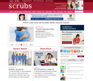
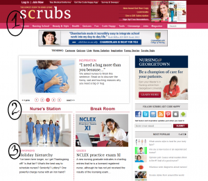
Scrubs online magazine
The purpose of the online magazine Scrubs is to guide nurses and nursing students in their personal and professional lives. The audience is nurses and nursing students. It can be seen mostly from the content of the website. It is not gender oriented. Throughout the website we can see pictures of people in the nursing uniform of different gender, age, ethnicity, size, etc. Nursing is a culturally diverse profession that is also can be seen on the website. The website design is not an extraordinary but pictures and subjects will definitely attract nursing (current and future) audience. The busy organization of the website most likely not to scare nursing audience due to the amount of reading they always get.
Design elements:
Emphasis. Although the website is pretty crowded, the viewer is guided by the red color which shows what pieces of information are the most important. The website employs the idea of visual hierarchy which allows arrangement of elements according to their importance. Firstly, big heavy red line on top of the page shows the name of the website along with main categories. Secondly, throughout the main page the viewer can see other red colored headings with red separation lines which guide the gaze. Thirdly, the headings are of different importance on the main page and the rest of the pages. This can be seen from: The biggest, the boldest, and the brightest text. These declines as the viewer reaches less significant headings.
Contrast. Using this principle allows visually organize information. As been said earlier the website employs contrast by size (Bigger headings vs smaller rest of the text), weight contrast (bold headings vs regular text), color contrast (shades of red and black).
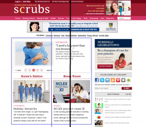
Balance. The page is symmetrically balanced. It can be divided in the middle into two symmetric parts. However, the website has nursing info on the left side and ads on the right side. If we take into account only nursing info – it is also symmetrically balanced. It is also balanced by color. Red color is evenly distributed throughout the page.
Alignment. Organizes page into orderly message. Firstly, lines which are grouped belong together by containing relative information which makes it easier to follow the message. Secondly, the website employs flush left type of text alignment. The messages are quite long which makes it best to use this type of text alignment. The lines are of the same width. Thirdly, some empty space makes webpage less busy and gives separation to different subjects.
Repetition. Makes the page easier to read and navigate. Repetition of shapes – each topic is placed in a separated rectangular. However, even the content is different, same organization is used in each rectangular: same heading styles, colors (repetition of color), and one image (repetition of images). This style unifies the website and makes it easy to navigate and recognize relative information and structure.
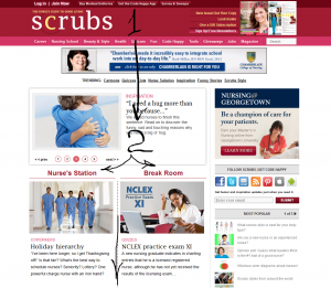
Flow. Takes the viewer of the webpage throughout all of its elements emphasizing what’s important. It gives the order its natural flow from top to bottom. SEQUENCE: The ad is made in a vertical pattern together with a horizontal pattern. On top of the image where the gaze goes first we can heavy red line with the name of the website. Then our gaze goes down. At the midline our gaze stops for a moment while trying to look at the changing messages which increases our curiosity. We keep moving towards the bottom where we can see horizontally equal rectangulars. These structures confuse us a little bit. Our gaze afterwards keeps going down.
Design elements guide the audience throughout the website. The color is unisex which doesn’t concentrate on any specific gender. The contrast and emphasis make it easier to find more important points. However, the website seems a little bit too busy. The switching subject window with current news should be bigger. The news could be contrasted for current/future nurses.
The website constantly uses outside resources such as images. Images are cited with the name of the photographer or a company with no link provided.
I hope to make my video resume different and interesting. As of right now, the key message would be to show myself as responsible and caring person. I will be dressed in my nursing school uniform. I will talk about my experience which is not as reach as I would like it to be. Therefore, I will try to show what I’m capable of achieving. I will include my volunteering activities. My education with the description of classes I’m currently taking. I will definitely include pictures of myself – something that I wouldn’t normally include in my traditional resume. I will also include my philosophy about nursing and what it means to me. I will talk about diversity making my foreign origin as an advantage.
Video resume is a short video created by a candidate for employment that describes the individual’s skills and qualifications and is typically used to supplement a traditional resume.
If done properly video resumes can assist in getting a job. However, if done badly, it can not only prevent from getting a job but also embarrass a candidate. Once created candidate can upload it to different job searching website along with the traditional resume, or can create personal website and link to it.
The good:
Dress professionally like for in-person interview, keep your video resume short 1-3 min, look at the camera. Practice what you’re going to say ahead of time. Start by mentioning the name (first and last).
Discuss why you would be a good employee and what you can do for the company that hires you. Thank the viewer for considering you for employment.
Ask friends/family to review
Use the video to help the employer get a sense of not just what you have achieved, but what you are capable of achieving in the future.
Be creative, whether that’s with the concept of your pitch, use of humor, clever production values or brilliant editing.
The bad:
Speaking too fast. Unprofessional noisy background.
Don’t mix your personal life with professional one.
Don’t just create a video resume because you can, create one because it’s relevant to the job you want to do.
Don’t send a video resume to a more traditional type of company that won’t “get it.” You might do your chances more harm than good.
Don’t expect your video resume to replace your traditional resume.
Be creative, but professional.
The ugly:
The whole point of a video presentation is to offer a potential employer greater insight into you than a traditional resume can, so just reading aloud the contents of your CV is a waste of everyone’s time.
Don’t put content out there that you wouldn’t be prepared to get to public. Imagine your friends and family watching the clip. If the thought of that embarrasses you, then don’t submit it.
In fact, many recruiters won’t even accept resumes with photos attached for fear of lawsuits. They’re worried that video resumes will invite lawsuits by candidates who could claim bias based on race, gender or age-indiscernible on paper but not on video.
Part 1. Project Description
& For this project I created a separate category where all my Project 2 works can be found.
& The purpose of the ad is to attract female students to take the English Digital Writing class.
& The audience would be female students. The female’s face in the ad is blocked by the globe making it hard to tell about her age; therefore, the audience would be female students of any age. In today’s world women hesitate taking classes or choosing majors which deal with technology thinking that it might be too hard for them. It happens because in our society male association with technology predominates. Women are socialized as passive consumers of digital writing when in reality they are not only active consumers but also are more than capable to become successful producers in the digital world.
& The image I used for my postcard I found on Compfight website. I have purposefully chosen a picture with Creative Common license “Some rights reserved” which allowed me to remix it. On the picture there is the female with the globe in her hands. I have edited the image using Photoshop. I already have had some experience with it. Therefore, I have decided to challenge myself with this program.
& Three elements I applied to edit the image: 1. Cut the image on top and bottom. 2. Took some other pictures with tools of digital writhing (camera, phone, and laptop) and cut off the white background while leaving only the tools. 3. Inserted those tools into the main picture under three different layers.
& Three elements of the image which meet the rhetoric situation: 1. The image of the female attracts other females. When females look at the image they unconsciously associate her with themselves thinking that if she can deal with digital writing they also can. 2. The female has a globe in her hands which blocks her face so it is harder to guess the female’s age which works well for the intended audience (females of any age). 3. The pasted images of camera, phone, and laptop bring to the image digital aspects showing that the world in your hands as well as camera, phone, and laptop. This is how it is easy to get connected with the rest of the world.
& The audio I used in the postcard was written and recorded by me using two programs: Audacity and Voice Memos. In addition, I have found the song which I added to smooth the background.
& Three elements of the audio which meet the rhetoric situation: 1. Both programs are tools of digital writing which they are free of charge and very easy to use. This itself shows to the intended audience how easy it is to make up the audio. 2. The text itself is appealing to the intended audience. It begins with the statement “If you think that digital writing class is too complicated for you, you are wrong!” This statement itself shows gender differences in today’s world. Often women think that they are not “smart enough” to deal with something digital. But further text brings them to the reality showing that such common things as text messages and pictures already make them active users of digital writing. With this being said I introduced more professional language suitable for students (active producer, collaborative consumer, digital information) and offered the viewers to take the English Digital Writing class in order to improve their skills and become even more productive user and even creator of digital writing. 3. Finally, I used the background music to make message more attractive and even fancy which female students might like.
& Resources which I had to cite were image and music. For the citation I linked to the original websites. In addition, I mentioned that the idea of using postcard for future students came from the professor. Finally, I said that the text was written by the author (which is me). I have posted all this information on the YouTube page under the description of the video. This is the most convenient way because future viewers will just need to click on the links to get to the original sources which attracts the intended audience even more due to the easiness of using and manipulating the tools of digital writing.
Part 2. Reflective Letter
& I am proud about being an active producer of digital writing. I am most proud about the idea itself and how I was able to put it into the final project. It was interesting to look at the little details which at the end played major roles in delivering the main idea.
& I was able to use the programs such as Audacity, Photoshop, Voice Memos, iMovie to bring my idea to life. With the exception of Photoshop these programs were free and very easy to use. They were appropriate for the project as they were available at any time and gave me enough options I needed to bring my project to life. I would definitely be smarter user of YouTube in terms of personal information. I learned my lesson too 😉
& If I had more time I would work on the image. The quality of the image is not as good as I expected it to be. Unfortunately, I didn’t have enough time to play with Photoshop which taught me a good lesson about choosing appropriate resources when working on the project. Photoshop itself is a good program; however, more time should be devoted to play with it.
& When I got stocked with my first idea as I didn’t think about rhetorical situation I have decided to modify it. My first idea can be found here. When I had a hard time with Photoshop I just did what I had to and moved on without exploring it more. I wish I had more time.
& As a result of the project I realized that, although, I am an active producer of digital writing, I still need to work on improving my skills. As my English professor says, “It’s never done; it’s always do.” I need to learn to plan my time better as well as learn to choose appropriate technology.
& Course outcomes (original text on the outcomes can be found here):
***Play In an experimental way I was able to come up with the final idea. It took me some time to figure out how I want it to be. I didn’t simply think of it I played with it. I first created one text and recorded it with Text to Voice program; however, I played with another idea and it worked better.
***Appropriation My goal was to define Digital Writing appropriately with the intended audience. Therefore, I found appropriate resources: image and music. I chose appropriate information, mixed it, edited it, and came up with the ready-to-go postcard which contains meaningful information for certain type of audience.
***Performance I was able to adopt female student identity for the purpose of delivering message on DW topic. I have chosen appropriate resources to create the message which made it look and sound attractive to female students.
Here is my final product

Advertising Agency: Leo Burnett Iberia, Madrid, Spain
Creative Directors: Francisco Cassis, Paulo Areas
Art Director: Pouline Atencio
Copywriter: Roberto Luque
Illustrator: Pouline Atencio
Published: December 2010
Posted on Ads of the World
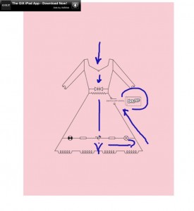 The purpose of the ad is to sell Bounce, an anti-static sheets you put in the clothes dryer. The audience of the ad are women who wear dresses or other types of clothe which deal with the static electricity issue. Firstly, the pink color of its background attracts feminine audience. Secondly, the image of the dress is likely to draw attention of women rather than men. The dress itself is made of physics structures which may not appeal to women a lot. However, static electricity is a physics feature. Therefore, someone with knowledge of physics can solve this problem and women will be free of it. The ad can be found in women’s magazines.
The flow principle of design is definitely used here. It takes the viewer of the ad through all of its elements emphasizing what’s important. It gives the order its natural flow from top to bottom. SEQUENCE: The ad is made in a vertical pattern with a few horizontal lines which enhances the vertical flow even more. On top of the image where the dress begins we can see an arrow pointing to the bottom of the image. At the midline our gaze stops for a moment while trying to understand why would this zig zag lines be on the dress which increases our curiosity. We keep moving towards the bottom where all these physics structures confuse us even more. Once reached the bottom our attention is cought up with trying to figure out what’s it all about. From here the viewr’s gaze with the help of the ride side of the dress is bounced towards the brand’s name where our problem is solved.
