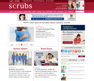
Scrubs online magazine
The purpose of the online magazine Scrubs is to guide nurses and nursing students in their personal and professional lives. The audience is nurses and nursing students. It can be seen mostly from the content of the website. It is not gender oriented. Throughout the website we can see pictures of people in the nursing uniform of different gender, age, ethnicity, size, etc. Nursing is a culturally diverse profession that is also can be seen on the website. The website design is not an extraordinary but pictures and subjects will definitely attract nursing (current and future) audience. The busy organization of the website most likely not to scare nursing audience due to the amount of reading they always get.
Design elements:
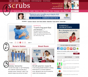
Emphasis. Although the website is pretty crowded, the viewer is guided by the red color which shows what pieces of information are the most important. The website employs the idea of visual hierarchy which allows arrangement of elements according to their importance. Firstly, big heavy red line on top of the page shows the name of the website along with main categories. Secondly, throughout the main page the viewer can see other red colored headings with red separation lines which guide the gaze. Thirdly, the headings are of different importance on the main page and the rest of the pages. This can be seen from: The biggest, the boldest, and the brightest text. These declines as the viewer reaches less significant headings.
Contrast. Using this principle allows visually organize information. As been said earlier the website employs contrast by size (Bigger headings vs smaller rest of the text), weight contrast (bold headings vs regular text), color contrast (shades of red and black).
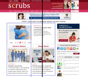
Balance. The page is symmetrically balanced. It can be divided in the middle into two symmetric parts. However, the website has nursing info on the left side and ads on the right side. If we take into account only nursing info – it is also symmetrically balanced. It is also balanced by color. Red color is evenly distributed throughout the page.
Alignment. Organizes page into orderly message. Firstly, lines which are grouped belong together by containing relative information which makes it easier to follow the message. Secondly, the website employs flush left type of text alignment. The messages are quite long which makes it best to use this type of text alignment. The lines are of the same width. Thirdly, some empty space makes webpage less busy and gives separation to different subjects.
Repetition. Makes the page easier to read and navigate. Repetition of shapes – each topic is placed in a separated rectangular. However, even the content is different, same organization is used in each rectangular: same heading styles, colors (repetition of color), and one image (repetition of images). This style unifies the website and makes it easy to navigate and recognize relative information and structure.
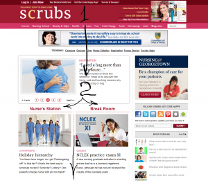
Flow. Takes the viewer of the webpage throughout all of its elements emphasizing what’s important. It gives the order its natural flow from top to bottom. SEQUENCE: The ad is made in a vertical pattern together with a horizontal pattern. On top of the image where the gaze goes first we can heavy red line with the name of the website. Then our gaze goes down. At the midline our gaze stops for a moment while trying to look at the changing messages which increases our curiosity. We keep moving towards the bottom where we can see horizontally equal rectangulars. These structures confuse us a little bit. Our gaze afterwards keeps going down.
Design elements guide the audience throughout the website. The color is unisex which doesn’t concentrate on any specific gender. The contrast and emphasis make it easier to find more important points. However, the website seems a little bit too busy. The switching subject window with current news should be bigger. The news could be contrasted for current/future nurses.
The website constantly uses outside resources such as images. Images are cited with the name of the photographer or a company with no link provided.


