Overall my classmates did a good job. However, what I have noticed – which helped me realize my mistakes is that we all probably saying the right things but we don’t use much terminology. We most likely to describe what we see but we don’t apply our knowledge to describe it in a right terms related to specific design. For example, we can talk a lot about shadows when we can simply say – contrast by color or symmetrically balanced. We are university students; therefore, we need to learn to think professionally and critically (in terms of deeper meaning behind the image).
Contrast
http://mblac018.students.digitalodu.com/?p=133#comment-193
http://mquer005.students.digitalodu.com/?p=129#comment-127
Alignment
http://jcher021.students.digitalodu.com/?p=116#comment-130
http://mquer005.students.digitalodu.com/?p=134#comment-126
Balance
http://nzewd001.students.digitalodu.com/?p=77#comment-102
http://dsmit182.students.digitalodu.com/?p=222#comment-119

Posted on Flickr by craig.letourneau.photography
Facebook, Twitter, MySpace, LinkedIn, Quizlet, Google+
My name is pretty rare, so my name wasn’t lost. I was able to find only a few pages on myself. Yahoo and Bing search engines were pretty straight forward: I got 1 result with exactly my name while Google gave me few more results slightly related to my first or last name, or combination. It is not a big surprise because I have only been here for three years. Nothing really shocked me or surprised me because I don’t really share a lot of information about myself online. I also have checked my name in my language and I was able to find a few old articles from my school about my participation. So far, I think what you share – that’s what you get.
Key words
Identity “represents the process by which the person seeks to integrate his (sic) various statuses and roles, as well as his diverse experiences, into a coherent image of self”. (Epstein, 1978, p. 101)
Professional identity is defined as one’s professional self-concept based on attributes, beliefs, values, motives, and experiences (Ibarra, 1999; Schein, 1978).
Online identity, internet identity, or internet persona is a social identity that an Internet user establishes in online communities and websites (Online identity, 2012).
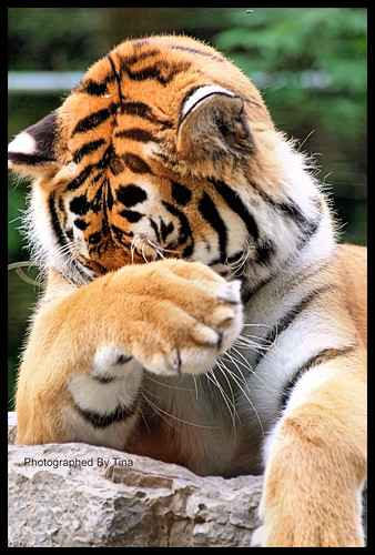
Posted on Flicker by TakenByTina
Brief summery
Professional identities are built up on how we feel about being professionals, what do we do as professionals, and how our colleagues see us. Since recently we can also add to it who we are outside of working facility and who we are online. Things we do, write, say, type; even who our friends are can tell a lot about us even to those people who we had no intention to give the information to. Our personal have fused with the professional (Kerwin, 2008). It is called social background check. More information can be found here. So it is best to keep the information private and clean. Be aware that everything you say online can be traced to you, and you can get in trouble or……if you wisely mange the information you share online, may actually work FOR you! If your online reputation is not great, there are surely certain things you may do to clean it up: however, the best thing you can do is to carefully watch what you do and eventually with whom and where you share it.
Relations to course outcomes
As current students we have to understand that we are about to enter professional world where things we do and say matter. Unfortunately (or fortunately) this becomes a big deal not only since the time we get our diploma but much earlier…as soon as we join online membership. Therefore, as future professionals we have to build our online reputation today so we can get hired tomorrow.
Works Cited
Epstein, A. (1978) Ethos and Identity, Tavistock, London
Kerwin, A. (2008, July 07). Managing Your Professional Identity. Retrieved November 09, 2012, from slidshare : http://www.slideshare.net/awildish/managing-your-professional-identity-502562
Online identity. (2012, October 12). Retrieved November 09, 2012, from Wikipedia: http://en.wikipedia.org/wiki/Online_identity
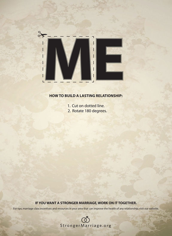
(Advertising Agency: Richter7, Salt Lake City, USA
Posted on demilked
The purpose of the ad is to advertise the company which offers services on making marriages stronger. The target audience would be married couples who are unhappy in their marriages. By only looking at this ad couples who want to improve their relationship can already get a worthy advice which may make them to go on the website. The image with emphasized ME looks gray and lonely which makes the viewers compare their lives with the world where “ME” dominates. By cutting out M and turning it over couples may change their lonely lives and become happy again. The ad could be found where married couples are: on the streets, magazines.
The ad employs alignment principle of design which organizes page into orderly message.
*Firstly, lines which are grouped belong together by containing relative information which makes it easier to follow the message.
*Secondly, the ad employs centered type of text alignment. The message in the ad is rather short allowing it to use this type of text alignment. The second line is the same wide as the word ME. The directions (3d and 4th lines) are easy to follows due to numbered format.
*Thirdly, a lot of empty space and grey cold colors coincide with the idea of loneliness which people with unhappy marriage may experience.
The image also uses the following principles:
-Contrast – black letters on light background, bold vs regular type
-Balance – symmetrical left and right sides
-Emphasis – the word ME with “cut out” option

Advertising Agency: LOWE Adventa, Moscow, Russia
Creative Director / Art Director / Copywriter: Andreas Mielenhausen
Designer: Roman Alekhin
Published: October 2010
Posted on Ads of the World
Beeline is a network company which offers mobile, TV, and internet services. Main office is located in Russia (it may explain why you probably never heard about it). It has always been known for the creativity of its ads. In its ads it has always had young people which are the target audience. Those young people are not shown here; however, the types of technology which are shown in the ad are mainly for younger generation users. Besides, younger generation tends to have less money; therefore, they would be more likely to look for discounts for necessary services. Young families are also a target population who could benefit from buying a package for their new home. This ad can be found anywhere where the younger people are: on the streets, in the magazines, on TV, online on the websites, etc.
This image uses strong contrast which quickly and effectively attracts attention.
Contrast by color: There are two color ideas. Firstly, message in black and yellow stands out very well on the white background allowing all attention to the message. Secondly, addition of yellow color to identify the product itself contrasts with just black color of the other parts of the message. The yellow color elements are balanced on the page (left upper corner and right lower corner) which also emphasize the element of flow where gaze comes from the upper left to lower right where the brand name is.
Contrast by size: coincides with whole idea. On the left side, where the first attention is drown due to the contrast by color and size, the viewer can see products – a lot of products which occupy the better portion of the image. In other words, a big package. While on the right side same elements shown from the other angle but they look smaller which matches the idea of paying a little money to buy the big package. The image employs the principle of symmetrical balance.
I have finished my final audio postcard text:
If you think that digital writing class is too complicated for you, you are wrong! Have you ever sent a text message or taken a picture? If yes, then you are already a very active producer of digital writing. By taking this course you will improve your skills on creating and sharing digital information as well as become a critical and collaborative consumer of hypertext which will enable you to communicate more effectively in today’s digital world.
I have recorded a script (only in Audacity format).
I have found the following pictures which I am planning to add to my final image for postcard using PS.
Some tutorials on PS:
Photoshop Elements – How to copy and paste objects into another photo.
Photoshop tutorial cut paste and warp
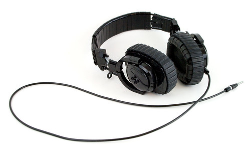
Posted on Flickr by eldeeem

Posted on Flickr by Saud alageel
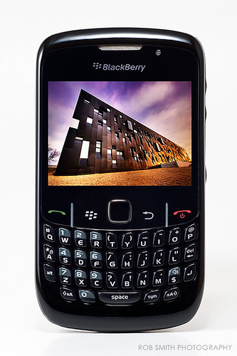
Posted on Flickr by rob smith photography
Posted on Flickr by Luigi Strano FDV

Advertising Agency: Y&R Reklamevi, Istanbul, Turkey
Creative Directors: Ozan Varışlı, Utku Gürtunca
Copywriter: Ömer Onsun
Art Director: Erhan Dursun
Illustrator: Zoo Istanbul
Client Directors: Özlem Ünlüçay, Burçin Yavuzarslan
Published: May 2010
Posted on Ads of the World
The purpose of the ad is to sell energy saving washing machines by Arcelik. The intended audience would be urban residents who practice or would like to practice saving the environment, in other words, use “green” technology. It can be seen in the ad due to green spots among the urban buildings and the text on the bottom saying “World needs more green”. The washing machine in a lower left corner doesn’t attract the most attention which makes it look even more natural within the given environment. In addition, the clothes inside the washing machine are green which strengthens the idea. It could be assumed that the ad is for female customers because it deals with household product; however, there is no direct relation to females in color or composition. Moreover, the image itself looks gray, very high tech, and detailed; therefore, it creates the same impression of the washing machine, which can attract attention of male customers.
Image could be found in household magazines, in magazines promoting “Green” life style, in any kind of biological or geographic magazines, business magazines, or on billboards in urban areas or parks. After viewing the image a viewer can be inspired to find out more about this product or even search for other “green” products and benefits of using them.
This image is a little crowded; however, author(s) was (were) able to achieve balanced to make it more functional and proportional. Color wise the image is very consistent. It employs only shades of gray and dark green which are evenly distributed throughout the image and give image natural urban colors with emphasis on necessity of increasing of green environment. There is a dark grey frame which creates an illusion that objects that are inside are “lifting” off the page. The right upper corner catches the first attention. Then the gaze goes to the biggest middle ring, and then to the washing machine itself (Principle of flow). Pretty much the whole image copies shape and idea of the washing machine (principle of repetition). From there the viewer looks at the brand name which is very distinct and easy to read. All four corners have something whiter and brighter than the rest of the image. Moreover, the biggest circle is located right in the middle. It all employs symmetrical balance.
The principle of balance of the image is mixed with principles of repetition and flow making it more communicative and functional.
 CC Image #1
This image shows the girl with the “world” in her hands. I may insert digital accessory and make linear connections with different points on the globe to show how easy and quickly it is to spread digital message.
Posted on flickr by UvaFragola
 CC Image #2
In this image there is a guy with wrench in his hands. He is trying to fix digital “world”. I may insert liens which would connect him (his tool or his head = ideas) with the points on the globe to show how easy and quickly it is to create and spread digital message in digital world.
Posted on flickr by jaci XIII
 CC Image #3
There is a robot which carries the globe. Robot would mean digital nature leading today’s world. I may insert some words which the robot may say.
Posted on flickr by Kalexanderson
I am thinking to add new items to the image; therefore, I am planning on using photo editor which allows me to play with layers. I have tried Ps before and worked with layers. It was a few years ago and I want to refresh my memory. I may also use Google Image program because it is free and it is something I can use outside of the class.
In changing society media reflects its dynamic nature. If yesterday newspapers and magazines were enough to suit the needs of the previous generation, today’s form of communication is digital. Firstly, it is created digitally using numerous types of software. Secondly, it is shared digitally which enables quick two-way communication with ….audience. The examples of digital writing would be blogs and text messages. Studying digital writing is important because it enables its users to communicate effectively in today’s digital world.
Digital Writing – created digitally – shared digitally – digital writing – digital world
Audacity
Advertised by Advertising Agency: Bates Y&R, Copenhagen, Denmark. Posted on TOXEL.com
Jeep is a model of car which is popular nowadays. It is best known for its ability to ride off roads and on roads in bed conditions. Sometimes people who live in urban areas don’t get to enjoy this advantage of the brand due to good quality of roads. Therefore, the purpose of the ad is to sell Jeep to urban residents . The ad is fun and inspirational. The audience of this ad would be urban drivers who enjoy challenges and like riding anywhere with no limits even within the cities. It is seen in the ad because parking spaces are in very inconvenient locations where it wouldn’t be possible to park for other types of cars. Jeep is usually for middle class population primarily because of the gas cost. In addition, this ad may appeal to younger generation because younger people tend to do something reckless like parking on curb or off road. The ad could be found in car magazines, in magazines focused on outdoor activities, and in crowded cities with little parking lots. After viewing the ad the audience may wonder what are other challenges Jeep can deal with so it may make them go on Jeep website or or Jeep dealership.
Repetition principle is seen in four images combined together in one picture. All images are very similar. All of them were taken in urban areas in different locations but with the same idea. All pictures are of a grey shade with bricks and some kind of barrier (stairs or curbs) and white lines with Jeep logo in each of them. Right upper and left lower pictures were taken from the same angle as well as left upper and right lower are of the same angle. The right upper square attracts the most attention it is well defined and the most challenging. Repetition principle supports the audience by showing in every picture that Jeep owners can deal with all the challenges. It shows constant challenge which strengthens and unites the idea. The design is organized which makes it easy to interpret for the audience.