Archive for October, 2012
I have finished my final audio postcard text:
If you think that digital writing class is too complicated for you, you are wrong! Have you ever sent a text message or taken a picture? If yes, then you are already a very active producer of digital writing. By taking this course you will improve your skills on creating and sharing digital information as well as become a critical and collaborative consumer of hypertext which will enable you to communicate more effectively in today’s digital world.
I have recorded a script (only in Audacity format).
I have found the following pictures which I am planning to add to my final image for postcard using PS.
Some tutorials on PS:
Photoshop Elements – How to copy and paste objects into another photo.
Photoshop tutorial cut paste and warp
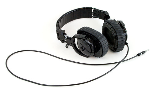
Posted on Flickr by eldeeem

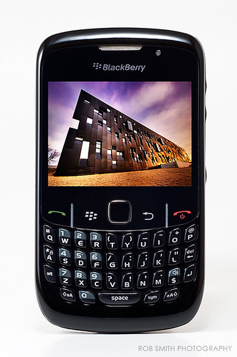
Posted on Flickr by Saud alageel
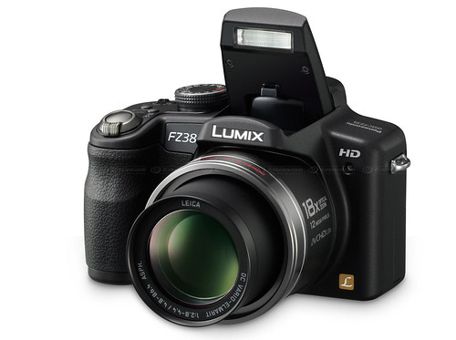
Posted on Flickr by rob smith photography
Posted on Flickr by Luigi Strano FDV

Advertising Agency: Y&R Reklamevi, Istanbul, Turkey
Creative Directors: Ozan Varışlı, Utku Gürtunca
Copywriter: Ömer Onsun
Art Director: Erhan Dursun
Illustrator: Zoo Istanbul
Client Directors: Özlem Ünlüçay, Burçin Yavuzarslan
Published: May 2010
Posted on Ads of the World
The purpose of the ad is to sell energy saving washing machines by Arcelik. The intended audience would be urban residents who practice or would like to practice saving the environment, in other words, use “green” technology. It can be seen in the ad due to green spots among the urban buildings and the text on the bottom saying “World needs more green”. The washing machine in a lower left corner doesn’t attract the most attention which makes it look even more natural within the given environment. In addition, the clothes inside the washing machine are green which strengthens the idea. It could be assumed that the ad is for female customers because it deals with household product; however, there is no direct relation to females in color or composition. Moreover, the image itself looks gray, very high tech, and detailed; therefore, it creates the same impression of the washing machine, which can attract attention of male customers.
Image could be found in household magazines, in magazines promoting “Green” life style, in any kind of biological or geographic magazines, business magazines, or on billboards in urban areas or parks. After viewing the image a viewer can be inspired to find out more about this product or even search for other “green” products and benefits of using them.
This image is a little crowded; however, author(s) was (were) able to achieve balanced to make it more functional and proportional. Color wise the image is very consistent. It employs only shades of gray and dark green which are evenly distributed throughout the image and give image natural urban colors with emphasis on necessity of increasing of green environment. There is a dark grey frame which creates an illusion that objects that are inside are “lifting” off the page. The right upper corner catches the first attention. Then the gaze goes to the biggest middle ring, and then to the washing machine itself (Principle of flow). Pretty much the whole image copies shape and idea of the washing machine (principle of repetition). From there the viewer looks at the brand name which is very distinct and easy to read. All four corners have something whiter and brighter than the rest of the image. Moreover, the biggest circle is located right in the middle. It all employs symmetrical balance.
The principle of balance of the image is mixed with principles of repetition and flow making it more communicative and functional.
 CC Image #1
This image shows the girl with the “world” in her hands. I may insert digital accessory and make linear connections with different points on the globe to show how easy and quickly it is to spread digital message.
Posted on flickr by UvaFragola
 CC Image #2
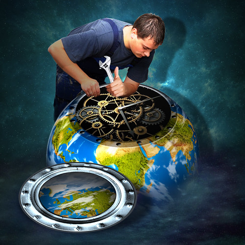
In this image there is a guy with wrench in his hands. He is trying to fix digital “world”. I may insert liens which would connect him (his tool or his head = ideas) with the points on the globe to show how easy and quickly it is to create and spread digital message in digital world.
Posted on flickr by jaci XIII
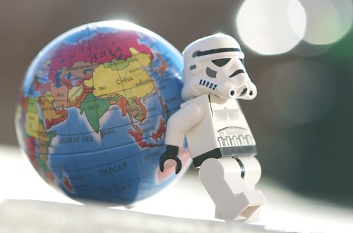 CC Image #3
There is a robot which carries the globe. Robot would mean digital nature leading today’s world. I may insert some words which the robot may say.
Posted on flickr by Kalexanderson
I am thinking to add new items to the image; therefore, I am planning on using photo editor which allows me to play with layers. I have tried Ps before and worked with layers. It was a few years ago and I want to refresh my memory. I may also use Google Image program because it is free and it is something I can use outside of the class.
In changing society media reflects its dynamic nature. If yesterday newspapers and magazines were enough to suit the needs of the previous generation, today’s form of communication is digital. Firstly, it is created digitally using numerous types of software. Secondly, it is shared digitally which enables quick two-way communication with ….audience. The examples of digital writing would be blogs and text messages. Studying digital writing is important because it enables its users to communicate effectively in today’s digital world.
Digital Writing – created digitally – shared digitally – digital writing – digital world
Audacity
Advertised by Advertising Agency: Bates Y&R, Copenhagen, Denmark. Posted on TOXEL.com
Jeep is a model of car which is popular nowadays. It is best known for its ability to ride off roads and on roads in bed conditions. Sometimes people who live in urban areas don’t get to enjoy this advantage of the brand due to good quality of roads. Therefore, the purpose of the ad is to sell Jeep to urban residents . The ad is fun and inspirational. The audience of this ad would be urban drivers who enjoy challenges and like riding anywhere with no limits even within the cities. It is seen in the ad because parking spaces are in very inconvenient locations where it wouldn’t be possible to park for other types of cars. Jeep is usually for middle class population primarily because of the gas cost. In addition, this ad may appeal to younger generation because younger people tend to do something reckless like parking on curb or off road. The ad could be found in car magazines, in magazines focused on outdoor activities, and in crowded cities with little parking lots. After viewing the ad the audience may wonder what are other challenges Jeep can deal with so it may make them go on Jeep website or or Jeep dealership.
Repetition principle is seen in four images combined together in one picture. All images are very similar. All of them were taken in urban areas in different locations but with the same idea. All pictures are of a grey shade with bricks and some kind of barrier (stairs or curbs) and white lines with Jeep logo in each of them. Right upper and left lower pictures were taken from the same angle as well as left upper and right lower are of the same angle. The right upper square attracts the most attention it is well defined and the most challenging. Repetition principle supports the audience by showing in every picture that Jeep owners can deal with all the challenges. It shows constant challenge which strengthens and unites the idea. The design is organized which makes it easy to interpret for the audience.
Key terms
Images are powerful part of page designer’s palette, they add impact to pages by making them more visually appealing, by evoking reader curiosity, urging reader action, or communicating important information.
Photographs are powerful visual images that can evoke strong emotional response in people because most people assume that camera doesn’t lie.
Cropping refers to the removal of vertical edges of a picture.
Flopping simply changes the direction of the image in a photo from side to side.
Silhouetted photos have portions selectively removed.
Illustrations can be diagrams, maps, charts, cartoons, or drawings. They are useful for telling a story or showing complex and detailed information that is otherwise difficult to show in any other way.
Clip art is a predrawn artwork that is sold in books, on disc, CD, or online.
Dingbats are small ornament pictures useful as bullets, icons, or small pictures.
Brief summery
The author talks about the importance of pictures in the works of digital writhing. Images style and add visual interest to pages. However, inappropriately chosen images confuse and distract the audience. There are few type of images can be used depending on concept and resources. Photographs seem more real than illustrations. In turn, illustrations are the only effective way to visually show ideas or abstract concepts. The right type of image helps put across a lot of information in a small amount of space. Images can be created by author or purchased for single use or multiple use design. Another resource is clip art which can be big time-saver.

Posted on flckr by zachstern
This is an example of editing pictures. The author takes an original and then works with it using photo editing tools.
In this case author multiplied the number of copies and edited copies in order to show the audience the difference. Therefore, his edited image goes together with the text. The text can be found here.
Relations to course outcomes
In the world of digital writing images play a tremendous role by reinforcing, explaining, and emphasizing text. Being able to create, select, edit, etc. pictures and effectively apply them in the work enhances the effectiveness and help communicate with the audience quickly. In our class we not only learn principles of working with pictures but also analyze works of others by looking at advantages and disadvantages.
Works cited:
Graham, L. (2005). basics of DESIGN. (second, Ed.) Canada: Thompson Delmar Learning. 306p. Pint.
 Emphasis on diversity of healthcare workers that would understand and take a good care of different types of patients. Healthcare is for different people; therefore, the audience is people with different heritage background. Healthcare workers would work for you as a healthy friendly young professional TEAM
It uses emphasis principle of design by showing all the hands of different people together at the center of the picture—> so you are in a good hands of workers who understand and help you no matter who you are and where you are coming from.
People are grouped in a circle meaning continuous care .
Trying to attract different people to use healthcare.
The only disadvantages are in the location of the people – superior to patients and only young personal
Posted on Shot of Prevention by Christine Vara
Key Terms:
Emphasis states the that the most important element on the page should be the most prominent, the second most important element should be second to the most prominent, and so on. It works hand in hand with the principle of contrast. The primary focus of emphasis is the intellectual analysis of the message to determine which words and phrases and graphics are the most important and, therefore, should be the most visually prominent.
Visual hierarchy refers to the arrangement of visual elements on the page according to their order of importance and emphasis.
Focal point is the visual element or part of a page that is most emphasized and therefore catches reader’s eye first.
Accents are secondary and tertiary focal points
Brief Summary:
We need to use emphasis to simplify the reader’s task and help pick out the most important things of the message. Determining the hierarchy and order of emphasis takes some effort but it improves with practice. Begin by deciding which words or phrases are the most important with consideration of the audience. Once decided, visual hierarchy plan is developed. This plan directs the reader’s attention to focal points. however, the author shouldn’t make too many focal points in order not to overcrowd the content. Some people find it handy to look at other people’s pages for inspiration and observation. Professional graphic designers use a number of visual techniques to establish strong hierarchy (e.g. making it boldest, biggest, and brightest, etc.). One problem that novices experience is that they overuse it. However, learning a skill means that missteps will occur. Keep the message simple, avoid emphasizing everything, and practice, practice, practice!
Relations to Course Outcomes:
It is very important for us the students of digital writing class to appropriately deliver the message. Therefore, we need to learn principle of emphasis in order to decide which pieces of information are the most important. It makes ir easier for audience and makes students effective writers.

This is an example of good emphasis technique. The most important words are the biggest and brightest which allows the audience to see the clear message.
Works Cited
Graham, L. (2005). basics of DESIGN. (second, Ed.) Canada: Thompson Delmar Learning. 306p. Pint.
Part 1:
I have devoted whole category to a Wiki Project. All things I have done and dates are listed under the Wiki Category and can be found here. My assigned work was page on Jenkins. In general terms I learned how to do variety of things:
– Created new page (e.g. I have created the pages on “Old/New Media”, “Affiliations”, “Circulations”, etc.)
– Added and edited text (e.g. “Lax“, “Jenkins“, etc.)
– Moved pages (e.g. “Key Terms“, “Issues“, etc.)
– Deleted pages (e.g. “Challenges of Participatory Culture”)
– Added images (e.g. “Image1“, “Image2“, etc.)
– Added hyperlinks (e.g. “Review Of Remediation“, etc.)
– Learned and applied repetition principle (e.g. all pages within Jenkis category)
– Consistently cited works (e.g. all pages within Jenkis category)
– Used appropriate content from assigned and outside resources (e.g. “Bolter“)
– Arranged information in a meaningful way
– Effectively collaborated with peers personally and digitally (e.g. “Comments“, I have provided the link: however, the page may be deleted by now)
Part 2:
- I was glad to be able to participate in this type of project. I enjoyed collaborating and playing with my peers. The main thing I am proud about is that we as a team were able to come to a common ground and make sense of the project which at first seemed as a chaos.
- For my personal contributions I was glad to be able to learn how to work with new website including creating, moving, and editing new pages. I feel like I made a big step forward towards learning not only what digital writing is but also how to interact with it effectively.
- If I had more time I would explore how to make the web site more interactive so it is not only text/videos/images. I would added flash intro page and made more creative layout design.
- The hardest thing I found for myself is to jump from page to page – it is time consuming. In addition, images tools are not very flexible. I just had to work with what I had. At the beginning Wiki project seemed confusing; however, I kept doing what I was assigned to. Now, at the end Wiki project makes perfect sense. I was also confused about citing images but I clarified the information with my professor.
- Wiki project gave me an opportunity to practice my collaborative skills. I was glad to find myself overcoming my language barrier and communicating well with my peers. I feel more confident; however, I want to continue working on my communication skills including leadership development.
- While working on the projects we were able to work towards the following outcomes:
***Play In an experimental way we were able to agree on the website structure. It took us some time to figure out how we want it to look like. We didn’t simply think of it we played with it. We moved pages around until we found a way to solve the problem. The example in this case would be a process and the result of playing would be final version of the Wiki Website.
***Appropriation Our goal was to define Digital Writing in a digital way. Therefore, we found appropriate resources: assigned and outside sources. We chose necessary information, mixed it, edited it, and came up with the ready-to-go website full of meaningful information from reliable sources on DW topic. The example would be any wiki page with text and matching image(s)/video(s).
***Collective intelligence It is a perfect example of what we did as team during the project. During the first part we had to provide the wiki with different information we learned in class. Each team member contributed his or her time, knowledge, and skills. During the second part we sorted the information and organized it in a meaningful way.
***Networking and Judgment would be examples of how we searched, chose, mixed, and evaluated information. There are lots of outside sources which we used during the project. As digital writers we were able to find information and process it. We chose the appropriate and reliable information. In addition, we gave credits for the authors by citing all the works used.
To sum it up, the project is a valuable tool not only for collection and organizing digital information but also for the ability to interact with digital writing and practice collaborative skills.

The end of one story is the beginning of another one!
Looking forward new projects!
On October 1, 2012 I have participated in a comment section concerning introduction page and web site layout design.