Key concepts
Contrast. Elements that aren’t the same should be very different so they stand out, making them “slightly different” confuses the user into seeing a relation that doesn’t exist. Strong contrast between page elements allows the user’s eye to flow from one to another down the page instead of creating a sea of similarity that’s boring and not communicative (Rundle, 2006).
Repetition. Repeat styles down the page for a cohesive feel — if you style related elements the same way in one area, continue that trend for other areas for consistency(Rundle, 2006).
Alignment. Everything on the page needs to be visually connected to something else, nothing should be out of place or distinct from all other design elements (Rundle, 2006).
Proximity. Proximity creates related meaning: elements that are related should be grouped together, whereas separate design elements should have enough space in between to communicate they are different (Rundle, 2006).
Connections to example: why is our website CRAP?
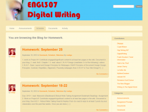
 Contrast is done by using shades of brown and color of blue which creates attention, differentiated elements, directs attention around the page. Important things are big in comparison to less important ones which are smaller. There is a contrast between background and text.
Repetition is used to create organization. Features that are repeated are colors, layout, navigation. It is applicable across the whole website which makes website distinct, memorable, and easy to use.
Alignment gives to the page a fresh look, organizes, and provides invisible lines which help drawing attention. All the features of the page are well balanced.
Proximity allows to group related elements together such as homework, contributors, etc. Website has enough distance between different objects and reduced space between related objects.
Relation to the course outcomes
It is very important to be able to spread message effectively. In the class we are taught how to do it. One the ways is to create website that catches attention of the audience. If the website is done well according to CRAP principles it is most likely that audience will be interested at looking at the website. Therefore, as students we have chance to learn the design rools and apply them on practice.
References:
Rundle, M. (2006, 04 10). How C.R.A.P is Your Site Design? Retrieved 09 24, 2012, from treehouseblog: Web
TISMWebDev. (2010, 05 31). Design Principles: Contrast, Repetition, Alignment, Proximity. Retrieved 09 24, 2012, from Web
Ward, S. (2007, 08 24). Is Your Web Design CRAP? Retrieved 09 24, 2012, from Pingable: Web
The formatting you chose to use is excellent and eye catching. I agree with most of what you had to say and it is evident that you actually read the article rather than skim over it. I keep on meaning to do some comments on relations to course outcome because if we can not use what we learn in class what is the point of learning it in the first place.
I love the use of font color to make the point of CRAP (definitely a savvy formatting option)